Building DuoCreator — Part 2: Designing Compact, Expanded and Tabletop Layouts for iPhone Duo
How DuoCreator uses DeviceHinge, onHingeChange and SwiftUI reserved regions to build a real layout policy instead of a pile of size-class conditionals.
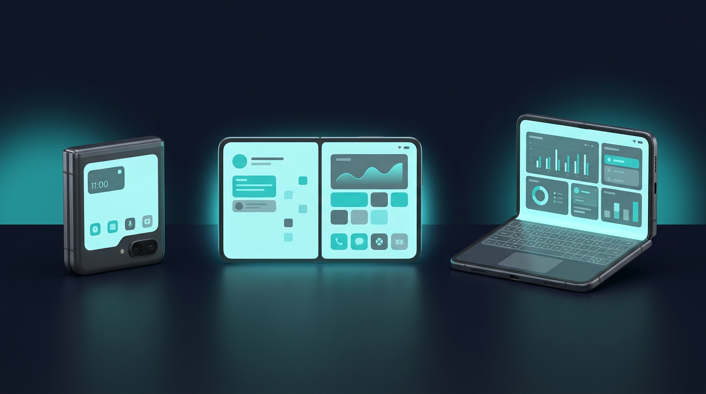
A foldable device creates a deceptively difficult UI question: when should an app actually change?
Width alone is not enough.
While building DuoCreator, I wanted the recording studio to understand three useful situations: a compact camera experience, a wide expanded workspace, and a partially folded tabletop studio. The third one is the reason a normal size-class-only solution was not enough.
Apple's iPhone Duo documentation gives developers hinge state through DeviceHinge and onHingeChange, and SwiftUI can expose reserved regions such as the physical division. Those APIs let the layout respond to the device instead of guessing from a screenshot-sized rectangle.
One observer, one policy
I created a small DuoLayoutObserver whose job is to observe the hinge and feed a simpler state into the studio.
The public idea is intentionally boring:
content(hingeIsPartiallyOpen, hingeAngle)
    .onHingeChange { _, context in
        // translate device state into app state
    }
The interesting logic lives in a layout policy. If the hinge is partially open, the app looks at the division and geometry to distinguish a tabletop-like arrangement from an expanded one. Otherwise, available width determines compact versus expanded.
Why put this in a policy instead of directly inside StudioView? Because hardware adaptation quickly becomes a pile of conditionals. A policy gives those rules a name and a place to evolve.
Compact mode
Compact mode keeps the traditional camera mental model.
The preview fills the studio. The teleprompter can appear over the preview without intercepting touches, and the most important controls sit near the bottom: switch camera, record, teleprompter and settings.
I want this mode to feel familiar even to someone who has never thought about a foldable phone.
That matters. New hardware does not justify making every state novel.
Expanded mode
Once there is enough horizontal room, the interface stops treating the script as an overlay.
The current implementation uses a split composition: camera preview on one side, teleprompter and control deck on the other. The recording engine is unchanged. Only the presentation changes.
This is one of the biggest design lessons from the project so far: adaptive design becomes much easier when the feature logic is not embedded inside a particular arrangement of views.
Tabletop mode
Tabletop is where the device starts to feel like a tiny creator workstation.
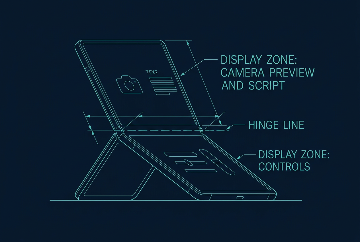
The Studio asks SwiftUI for reserved .division regions and uses the horizontal division to calculate upper and lower areas. The upper area prioritizes camera preview and script. The lower surface is scrollable and contains the control deck.
A reduced version of the geometry concept is:
let divisions = proxy.reservedRegions(kind: .division)
let upperHeight = division?.minY ?? proxy.size.height * 0.52
That is not the full production implementation, but it illustrates the important difference: the layout acknowledges the physical split.
If I simply used a 50/50 VStack, controls could collide with the hinge region or the proportions could feel wrong in real poses.
Don't hard-code a mockup
The product mockups look intentionally polished, but I don't want the implementation to be a pixel-perfect recreation of a render.
A mockup is useful for deciding hierarchy: preview here, script there, record button prominent, settings secondary. The shipping SwiftUI layout has to survive text size, localization, accessibility, different poses and changes in Apple's beta APIs.
That means using system layout behavior wherever possible and treating the concept art as a direction rather than a coordinate map.
Resizing should be normal
Apple's Human Interface Guidelines for iPhone Duo emphasize adaptable layouts and note that apps already designed for resizing can adapt with less work.
That is a useful warning against building a giant if device == Duo branch.
DuoCreator's three-mode policy exists because the studio genuinely benefits from different compositions. Other screens — projects, scripts, settings — should mostly behave like good responsive SwiftUI screens.
Special hardware should earn special UI.
Testing the transitions
The bugs I care about are not just "does expanded mode look good?"
I want to test transitions:
- compact → expanded
- expanded → partially open
- tabletop → expanded
- background → foreground
- recording while layout information changes
The recording state must remain stable while the presentation reorganizes around it.
This is another reason the camera engine and teleprompter engine are state objects independent from the layout branches. Replacing a composition should not accidentally replace the underlying recording session.
A small abstraction with a large effect
There is very little glamour in a type called DuoLayoutPolicy, but it is becoming one of the most important pieces of DuoCreator.
It lets the rest of the app talk about product concepts — compact, expanded, tabletop — instead of raw angles and rectangles.
That is the abstraction I want to keep as iPhone Duo moves from beta SDKs toward shipping software. Apple may refine the APIs or behavior, but the product question remains stable: what is the best creator workspace for the pose the person is using right now?
In the next part, I will move below SwiftUI and into the real AVFoundation capture pipeline behind the big red record button.
Follow or support the development of DuoCreator
DuoCreator is an independent project currently in development. This series documents the real engineering work behind the app as it evolves toward release.
If you represent a company and would like to sponsor DuoCreator, collaborate on the project, explore an integration, provide hardware or services for testing, or discuss another form of partnership, contact us at hola@ayudantedigital.es.
We're especially interested in collaborations that genuinely add value for creators and the emerging iPhone Duo ecosystem.
Apple references
- Apple Developer — Get ready for iPhone Duo
- Apple Human Interface Guidelines — Designing for iPhone Duo
- Apple Developer — Xcode 27.1 Beta Release Notes
- Apple Developer — Xcode system requirements
- Apple Developer — DeviceHinge
- Apple Developer — CameraCaptureAccessory
- Apple Developer — Foundation Models / SystemLanguageModel
- Series: Building DuoCreator for iPhone Duo
- Project: AppsForDuo / DuoCreator
- Suggested canonical home: appsforduo.com
Spotted something to fix, or an app we should cover?
This article is independent research, cross-checked against Apple's developer documentation. If something's out of date, or you know an app that deserves a look, let us know — and if you're building for iPhone Duo yourself, we're happy to talk.
hola@ayudantedigital.es